Delivery Dispatch System
A UI for delivery dispatch and rider management. Job assignment, live rider tracking and post-delivery reporting, designed end to end in Figma. The client didn't take it forward.
Case study
Dispatch runs on knowing three things: what needs delivering, who is free, and where they are. Most operations answer those with a group chat and a spreadsheet, which holds up until two riders are sent to the same pickup.
This was a UI for a delivery management system: jobs come in, get assigned, and whoever is coordinating can see where every rider is and what state each job is in without ringing round.
What the interface had to do
Assignment without ambiguity. A job has one owner and one state, both readable from the dashboard rather than a click deep.
Location as a real view, not a detail. A map with live rider positions, because "who is nearest" is the question a dispatcher actually asks, and a list of names cannot answer it.
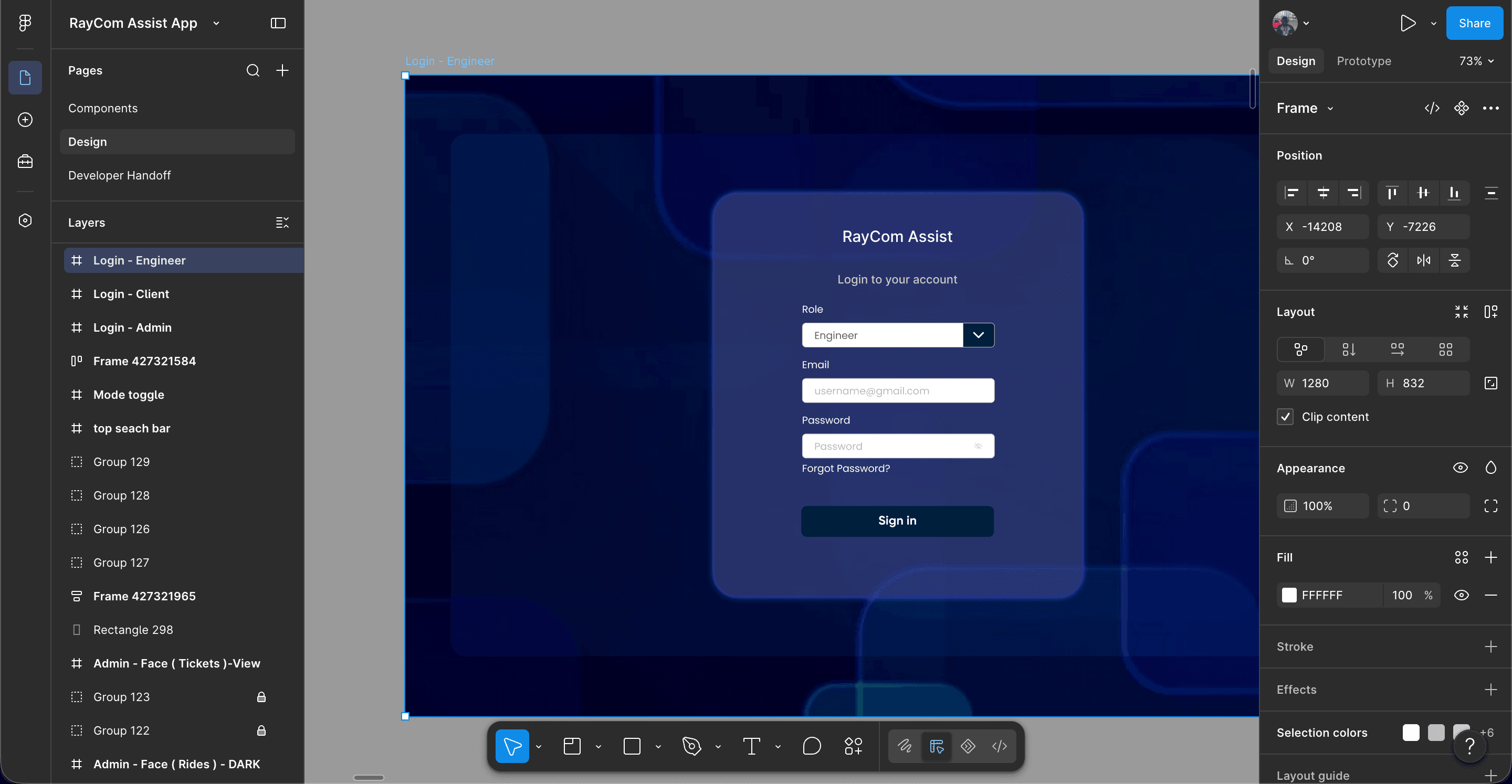
Roles decided at the door. Riders, dispatchers and administrators need different systems. That's settled at sign-in rather than patched over later with hidden menus.
A record after the fact. Reporting and ratings, so what happened outlives the conversation about it.
Designing the system, not the screens
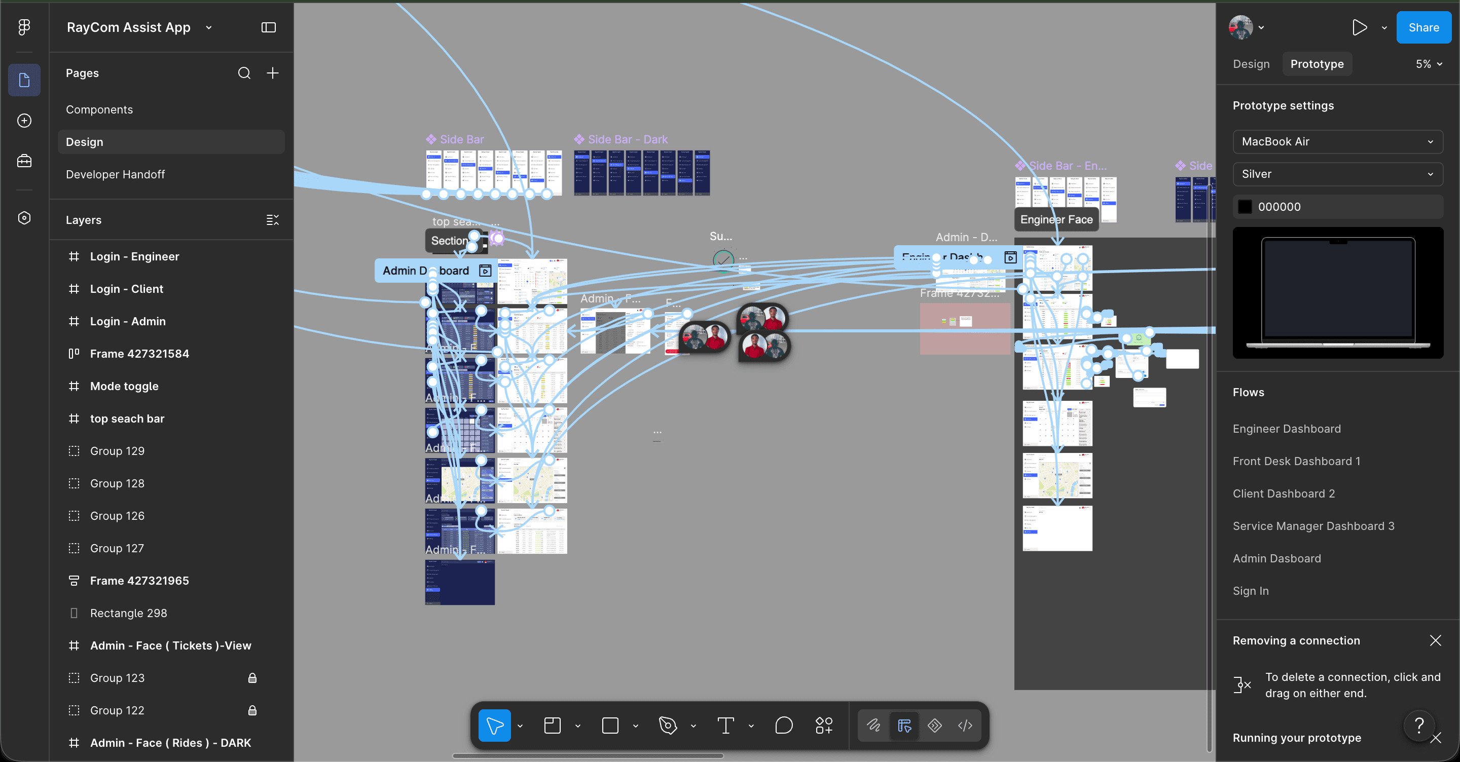
The flow map is the part worth looking at. Every screen is wired to the ones either side of it, so what got designed was the routes through the product rather than a set of attractive pictures that don't connect.
That matters more in an operational tool than anywhere else. Someone using this is standing outside with one hand free, trying to reassign a job. If getting from dashboard to job to reassignment takes four taps and a guess, the tool loses to the group chat it was meant to replace.
Where it ended
It didn't get built. The client didn't take it forward, which happens, and the design is the part I can show.
I'm including it because the thinking holds up independently of whether anyone shipped it, and because it's the clearest example I have of designing an operational interface rather than a marketing one.
Screens